ShopDreamUp AI ArtDreamUp
Deviation Actions


Suggested Deviants


Suggested Collections


You Might Like…


Description
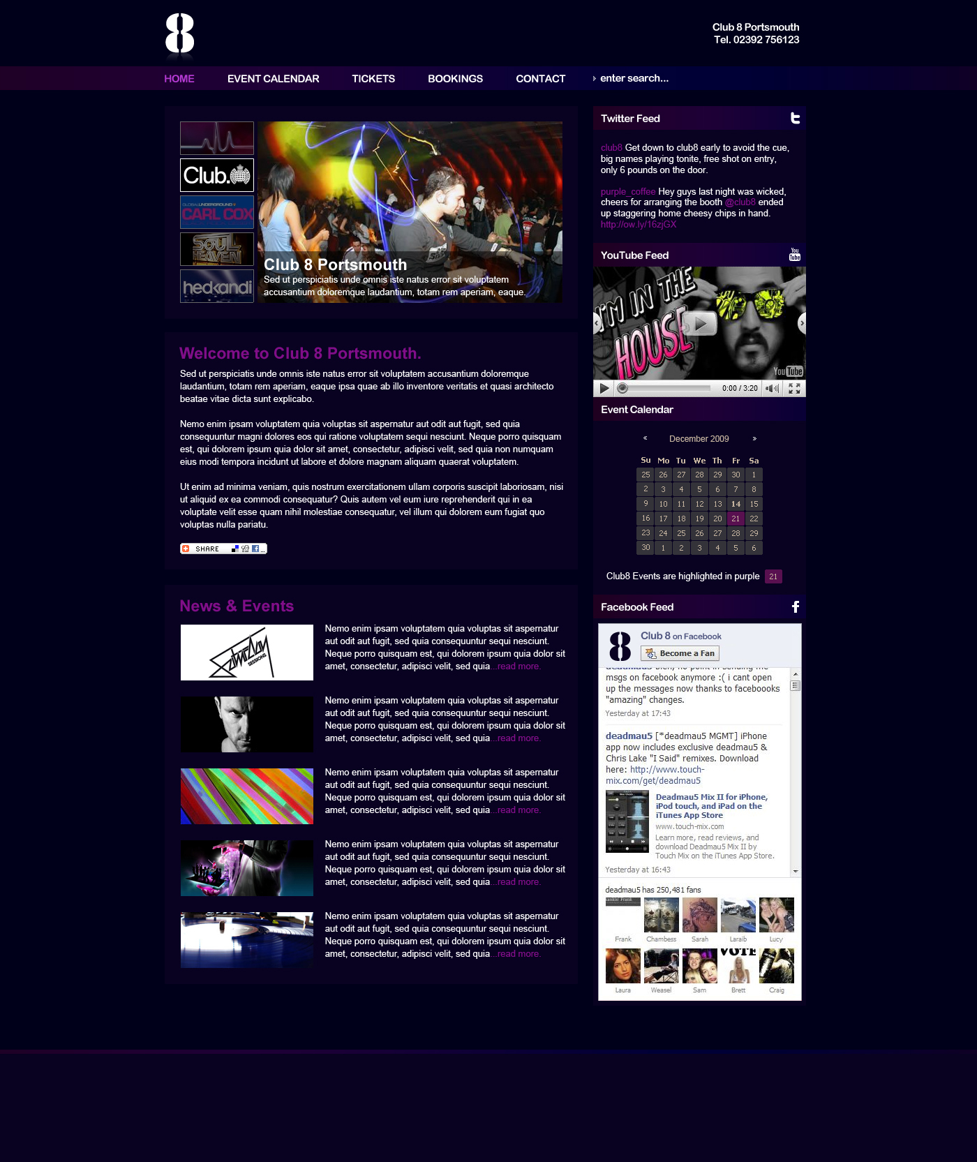
First draft for a night club in Portsmouth, UK. Any thoughts?
Image size
1400x1665px 977.9 KB
© 2010 - 2024 voodoosimon
Comments6
Join the community to add your comment. Already a deviant? Log In
Hey Jazmin!
The idea behind the calendar was really just to inform users that an event of some description is happening on a certain day. The idea been when the user clicks on a button it takes them to a comprehensive events page with events on this day/month more clearly displayed.
In a sense its acting as more of a hook/advert to inform users that such a function is available to them. I would expect most users would find the page it re-directs to of some use, however this could have been a wasted effort if not clearly advertised.
I am undecided about separating the right hand content areas, it is what i'd usually do as a convention, but in this case the page does become somewhat fragmented and a bit busy when separated due to the varying page elements. It also creates a fair amount of additional scroll hight which may effect page balance should the admin of the CMS have pages void of a few left hand content areas.
Excuse my lazy footer, there will likely be a newsletter sign up and social icons...as well as the generic copyright etc. I've really just put this up to get a little feedback before i go much further.
So thanks a lot for your comments!